
The Digital Divide: Data Storytelling and the Voices of People Living in Poverty
By Calum Webb
There is a concept in data science called ‘data storytelling’. Google’s chief economist described it as ‘the ability to take data — to be able to understand it, to process it, to extract value from it, to visualise it, to communicate it’. Stories that include a data narrative are powerful rhetorical tools; by which I mean they are very good for convincing people of what the writer wants to convince them of, because the numbers in the story often make the story sound much more legitimate — even if the numbers and their interpretations are wrong. In fact, it’s quite common for people to dismiss any truth in a story because it’s not ‘backed up by numbers’. In a fight between a ‘data story’ and any other kind of story, the data story usually wins.
Locked out of learning
The problem with ‘data stories’ being so powerful is that the opportunities to access the skills and tools required to create them — and the data itself — are not very fairly distributed at all. The ‘digital divide’ is well researched, where poverty makes it much harder to get access to computers or good internet. Also, because many of the skills required have only existed for less than a decade, many adults are locked out of learning them because of the under-funding of adult education services. Many children may be locked out of learning them because their schools have yet to introduce these skills to their curriculum.
Even if people want to learn these skills using free online materials, they may be prevented by: lack of access to the hardware required; lack of access to childcare or adult social care; having to work too many hours, or insecure hours, on low pay; inaccessibility of materials, due to them not being put together with disabilities in mind or written in a jargon-free way; or any combination of these reasons. If someone living in poverty wants to make their story into a ‘data story’, it is infinitely harder for them.
Power imbalance?
In this post, I want to try and explore the question of how we can empower people with lived experience in telling their own data stories (if they want to!) — or whether the problem is actually the imbalance of power between ‘data stories’ and ‘non-data stories.’
As stated, one solution we have to consider is for us to reject the assumption that ‘data stories’ are any more valid than any other kind of storytelling. While I think data and statistical stories do have too much power and influence at the moment, I think this solution can take us only so far. In the long run, it may not be for the best. Being able to put numbers on things we’re interested in is important. It also works both ways and can serve resistance as well as oppression.
For example, in the 1970s people were claiming that there was ‘no such thing as poverty in modern Britain’. They’ve been saying this for at least a century now; most recently it was Alan Sugar in 2015. In the 70s however, when Peter Townsend, Brian Abel-Smith and others highlighted the numbers of people living in poverty, and how the concept and measurement needed to be revised to fit the modern world, this showed that poverty still mattered.
Rebalancing influence
Similarly, today, ATD Fourth World, the Joseph Rowntree Foundation, and other organisations, researchers, advocates and activists, work to show that people living in poverty aren’t experiencing it because they are ‘lazy’ or don’t work. That actually the majority of people living in poverty are in paid employment, or otherwise busy doing vital roles like caring or volunteering. Being able to put a number on things is often effective for activism, so I don’t think we can dismiss ‘data stories’ outright, even if they have problems. Instead, we may want to rebalance how influential they are compared to other kinds of stories.
Another solution might be more similar to what we currently do: providing greater access to documents from research projects that contain key pieces of data, statistics, and graphs, so that people without access to the skills to produce them from the raw data can cite them. There is certainly a lot more work that can be done to improve this solution, such as making documents provided to people with lived experience more accessible, with clearer explanations and less jargon. But I still don’t think this is a perfect solution.
Who defines research?
While democratising research outputs can be helpful, it still means that (in many cases) the questions being asked and the parts of data being explored are dictated by researchers at universities or think-tanks, rather than by the people that the research is about. Often these projects, if they are funded by a research council or large charity, are also aligned to much bigger strategies that people with lived experience have little involvement in shaping.
These ways of working are slowly changing thanks to activists and participatory researchers; but we are still far from having people with lived experience leading and defining large research projects as a norm, especially when these projects involve statistical data analysis. So, while I think this solution is good, it is also a long way from enabling the goal we should be working towards: empowering people from any background in any circumstances to have the same access as anyone else to the resources they need to tell stories with data.
A creative approach to accessibility
My third solution involves researchers and anyone who works with data (including myself) thinking of much more creative ways to make it accessible and flexible to the many questions that we, as academics, may not even think about because we lack the lived experience necessary. Often, when people talk about making their data accessible, they mean making it ‘available’. However, for many people, this kind of ‘accessibility’ is not very accessible! For example, see below what the raw format of an ‘accessible’ set of data looks like.
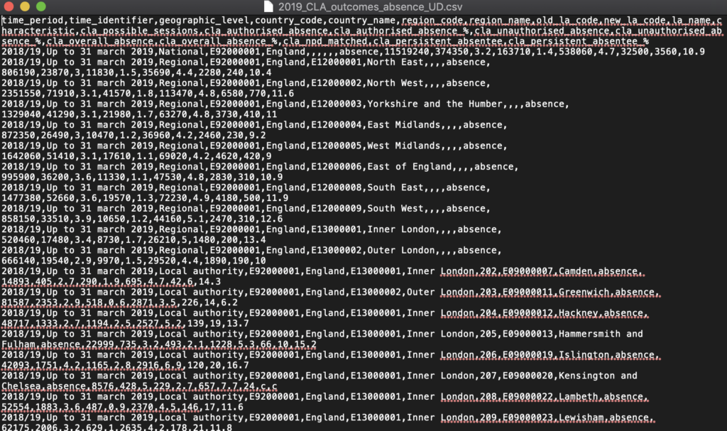
The image shows a screenshot of a set of data in comma separated value format. The text inside is closely compressed and hard to read. It is not clear how any of the information relates to one another.
This is what I mean when I say the data is ‘available’ but not ‘accessible’. I’m sure when I first saw files like this I had a little panic attack and felt like I’d never find the data I needed. This barrier becomes more and more insurmountable as you try to find data required to answer more complex questions, such as looking at how something has changed over time, or how strongly related it is to another piece of data in a different file.
Then you also have to worry about things like whether certain data has to be adjusted for inflation, or for population growth, or is covering the same boundaries of an area…. The list goes on and on! Here is an example of how much code it took me just to merge together nine years of a fraction of the data that the Department for Education releases about children in care (with a snippet in the image below). As they say in the infomercials: “there must be a better way!”
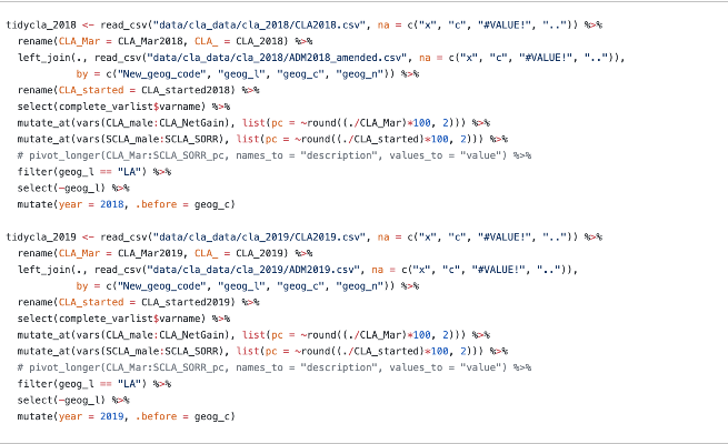
The image shows some programming code written in the R programming language. The text is densely packed and full of symbols. Not exactly something that you could pick up in an afternoon.
So, while I was finishing up the research I had been working on I was struck with a few thoughts. In no particular order:
-
This data is really hard to work with, even with my experience.
-
There is a lot of data here that would be useful for activists and advocates.
-
There is too much data here to put it all into a static report.
-
We’ve only explored a fraction of this; and the fraction we’ve explored is only about the questions that are relevant to us.
-
In our reports we have to focus just on the ‘average’ patterns, but normally people are much more interested in what’s been happening in their local area.
-
Others will sometimes ask people to prove that what’s been happening on average or nationally has also been happening in their town or city. They wouldn’t be able to prove this just with our reports; they’d need to go and do the same high-effort wrangling with the data I had done, which could take months!
The Child Welfare Inequalities Project App
So, as part of starting a conversation about our research, I created the “Child Welfare Inequalities Project App“. Its main reason for existing was so people could show their local authority or the government just how much the money had been cut over the years from early help and family support projects for kids, and that the cuts were bigger in Inner London and the most deprived places in the country.
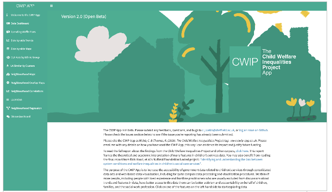
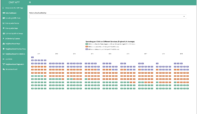
The two images above show the welcome page of the Child Welfare Inequalities Project App and the “Spending Waffle Plots” tab.
The number of things you can explore in the app and the way you can represent them has now been extended. There are almost 230 pieces of data about local authority children’s services in England between 2010 and 2019. I plan to add more — once I finish the difficult task of tidying it all up! There are also between 50 and 100 ‘small area’ pieces of data that you can map onto cities, towns, and counties. For example, you can show how much income deprivation there is across different parts of your local authority, or even the average travel time to get to a hospital from your neighbourhood.
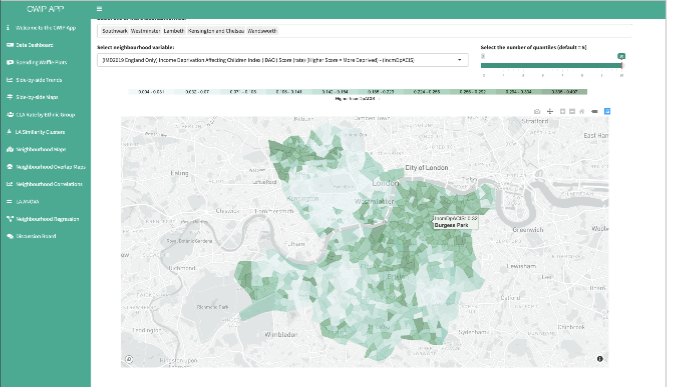
This image shows the proportion of children affected by income deprivation in small area neighbourhoods in Lambeth, Southwark, Westminster, Kensington and Chelsea, and Wandsworth councils. Dark green neighbourhoods are small areas with high levels of income deprivation, and there are many of these in Southwark and Wandsworth, as well as North Kensington. Light green neighbourhoods show low rates of children experiencing income deprivation, of which there are many of these neighbourhoods in central and South Kensington and Chelsea, in Dulwich and in the spaces between Earls Field, Balham and Battersea.
It’s important for me to say that this is all free, but you do need a computer and an internet connection. Everything you create using it can be used for any purpose. You don’t even need to credit me; and all the programming code used to create it is open-source so that anyone can download it, use it, or modify it for their own reasons. You can copy and paste any graphs directly into Microsoft Word or other things. It works okay on mobile phones and a bit better on tablets, but can sometimes be hard to navigate with these.
Democratising data with compelling visual tools
Things like the CWIP App clearly don’t completely solve the larger problems talked about here, but I think it takes a few steps in the right direction. It democratises some of the aspects of data storytelling that I think are more important than data availability: giving anyone who can interact with a browser access to the ability to ask their own questions of the data that’s out there, and the ability to communicate those results in a few different ways through data visualisation (the creation of graphs and plots that make the data visual). A combination of all three of the possible solutions I’ve listed here, in various amounts, is needed to truly enable people to tell their data stories with their own voice.
There is also something that I haven’t talked about elsewhere, and that’s the how the app and its visualisations look. I think, and this is just my opinion, that the app looks beautiful while also being informative. I got really sick and tired of seeing how, for example, the big consulting and accounting companies, and big research think-tanks, had all these beautifully crafted data visualisations and infographics to make their points. It might seem like a small or petty thing, but it has a real impact on how people interpret the arguments they’re reading. I think everyone deserves to have equally beautiful representations of the data that’s about their lives and the things they care about, especially when it helps people engage with their stories.
Unlocking data education
All of these solutions are only partial. In the end, anyone who wants to be able to create a data story from scratch, on their own or with their friends and community, should be able to. We, as a society, should want to make this possible. This means campaigning to have a society where people aren’t locked into learning only the things they were told to learn in school and held back from studying by the very limited budgets and time they have in their adult lives.
Working with data (and studying ‘data science’) can be a joy. It means being able to learn using data about anything you’re passionate about. There are always multiple ways to do the same thing, so you don’t have to be someone who thinks in a certain way. There are wonderful communities like the Rstudio community and the R for Data Science Online Learning Community, who emphasise supporting people from under-represented groups in data science. (Disclaimer: I’m not associated with either, other than as a user of R!) Also, you get to be creative and technical at the same time. All of these things have been huge motivators for me!
Insights from lived experience
I think it’s so important that experts by lived experience are able to create their own data stories. Their questions to the data and their interpretations of it are often much better than the interpretations of experts that don’t have lived experience, especially when looking at very specific data for a local area. Their data stories would probably provide much better insights for transforming services, or identifying problems with bias in the data that’s being collected, or explaining how parts of the data might be interpreted incorrectly or in a very narrow-minded way.
I hope more researchers will take up the challenge of asking themselves what they need to do to empower the communities they are researching to engage with data and statistics on their own terms. And in the long term, I hope we can move towards a more supportive society that values learning so that everyone has the same opportunities to pick up these skills.
If you would like to try out the Child Welfare Inequalities Project App, go to https://webb.shinyapps.io/cwip-app-v2/
Dr. Calum Webb is a sociologist at the University of Sheffield. He researches the measurement of poverty and how well it aligns with our theories of what poverty means and the lived experience of poverty. He also researches inequalities in the child protection system, highlighting how children from the most deprived neighbourhoods are up to ten times more likely to be taken into care than children from the least deprived neighbourhoods, and that the chances of this are even higher when they live in a place with high income inequality.